The border feels too thick, but there's also no visual identity between the different colors. You'll have ghastly creatures in any color and same with forest creatures and so on. Idk where that decision couldve come from, but it feels like a money constraint as they wanted to recycle the art 😬
Personally I just think you should never use white white. And the awkwardly offset off white within the white is just like ???
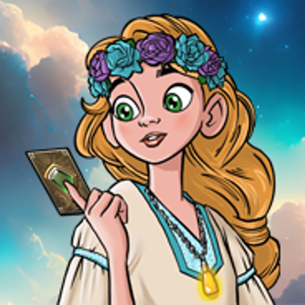
But the higher rarity cards look fine.


Replies
-
hard to screw up cards that are mostly art tbh, esp since these were made to show off the characters and not as side character cards for a different card game Like that victor has some layering but it's basically just art and text 😅
-
Though that border on Leona still looks chonky