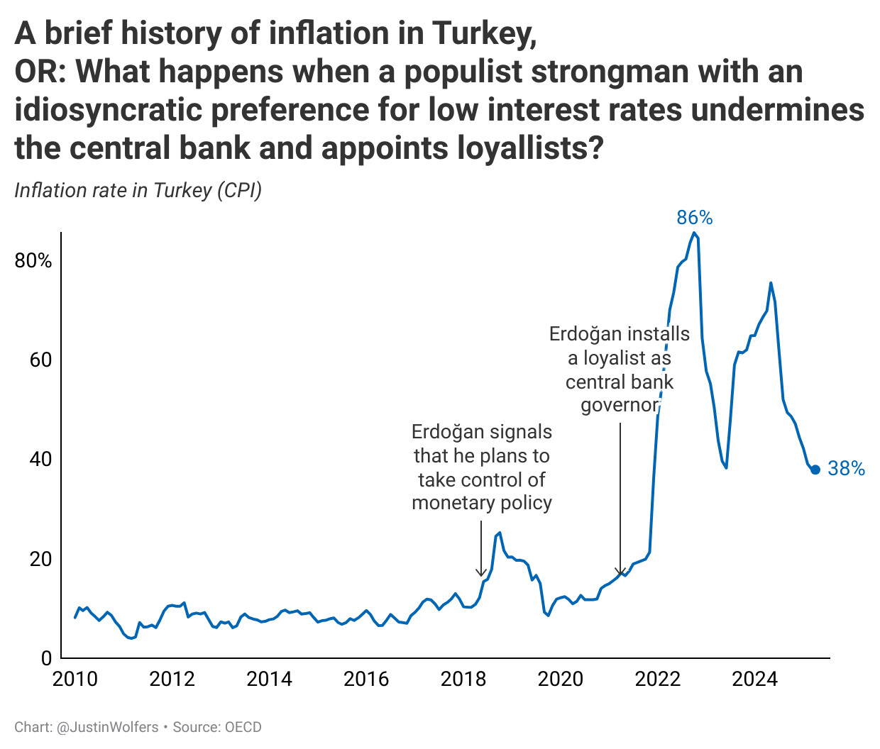
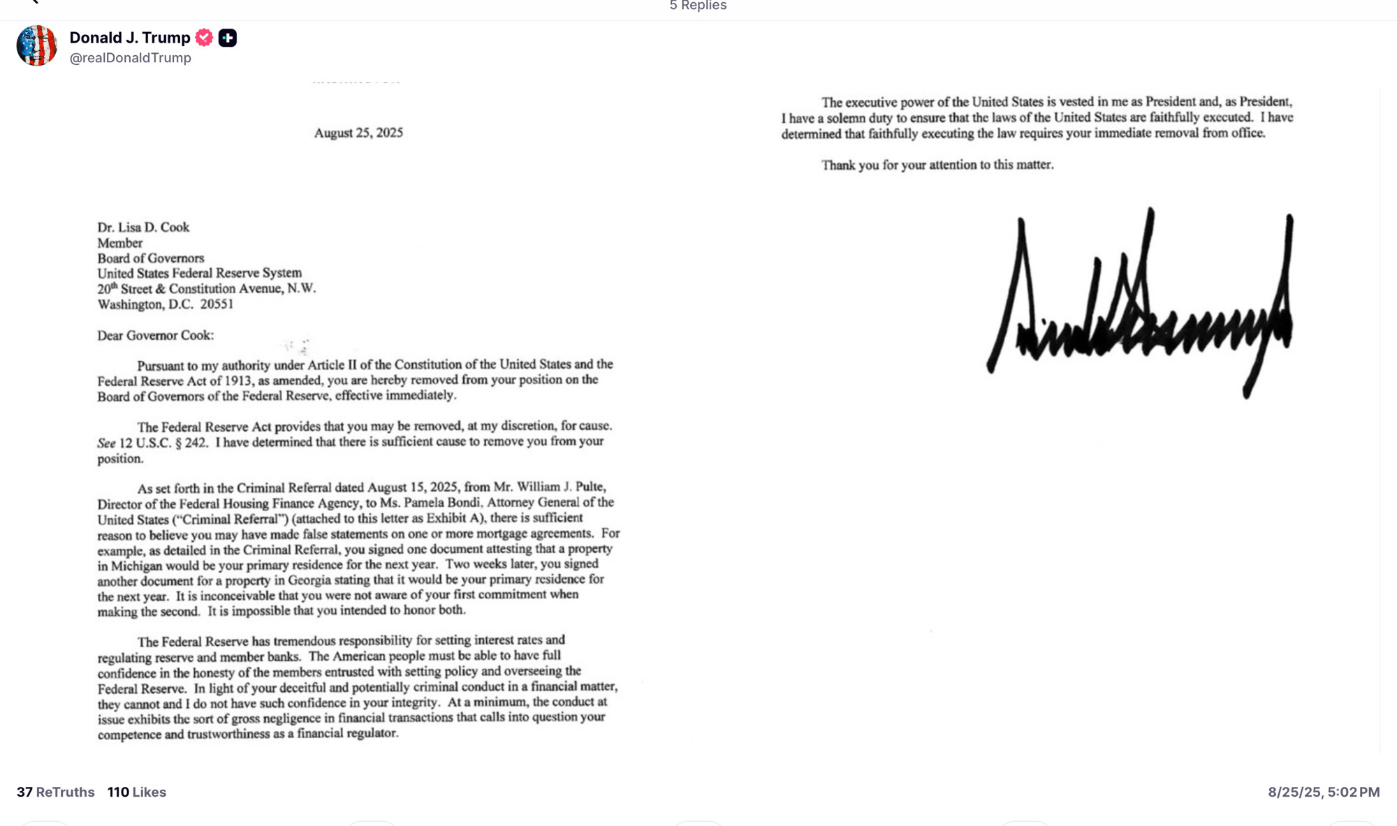
Yes, the stakes here are large. Very large.


Yes, the stakes here are large. Very large.


Many people look at this chart and don't understand that a chart of prices over time would look even worse (much worse!). I do wish—for the sake of clearer communication and more widespread audience insight—that economists would consider a different or additional presentation of the data.
An index...