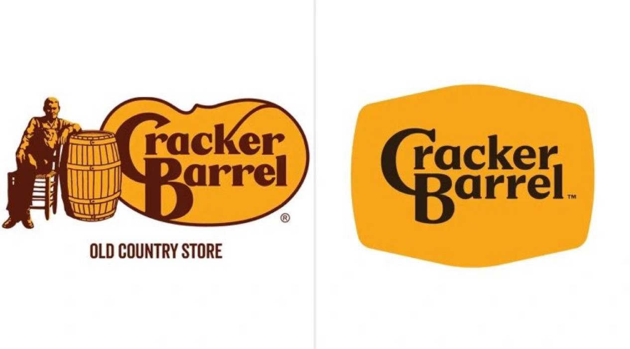
Tokyo Tek @teknasty.bsky.social 5 days ago Not them removing the cracker and barrel Fat Kid Deals @fatkiddeals.com 5 days ago 160 3029 10534
A Blue Six @abluesix.me 5 days ago I’m probably seeing things…but is it just me or does the ‘k’ in the old logo look like a whip? 1 0 0