Not them removing the cracker and barrel

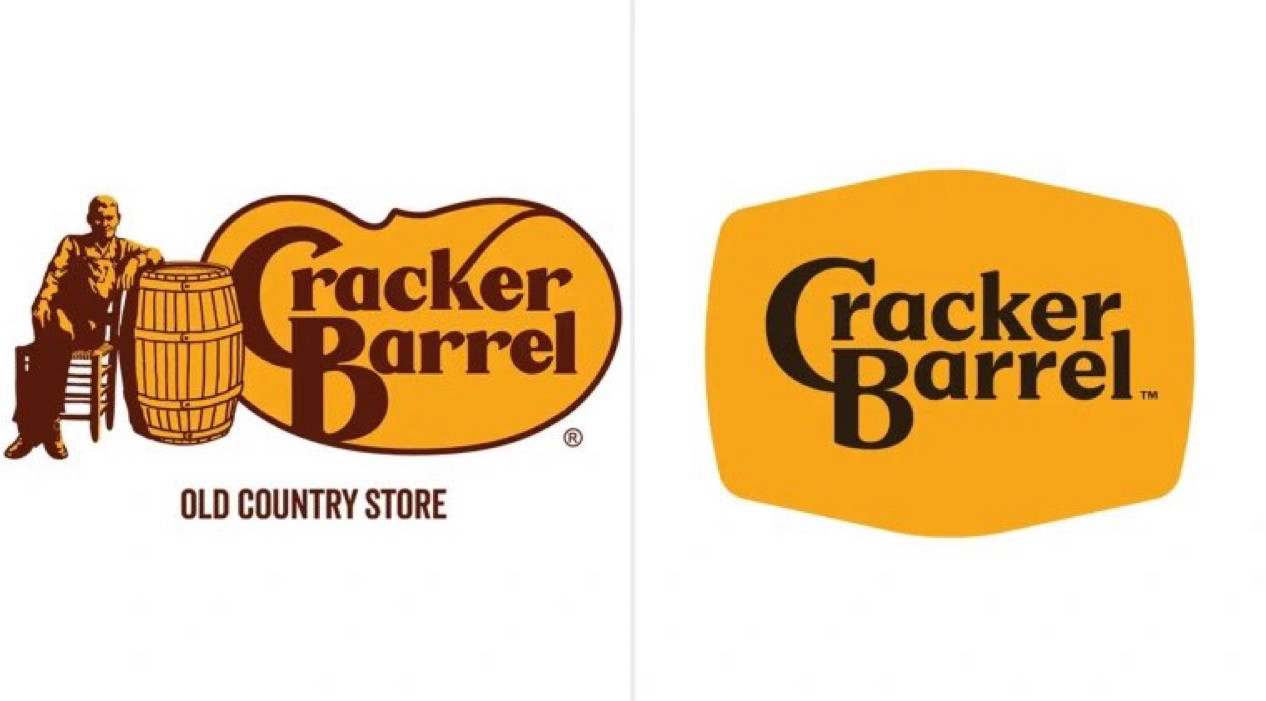
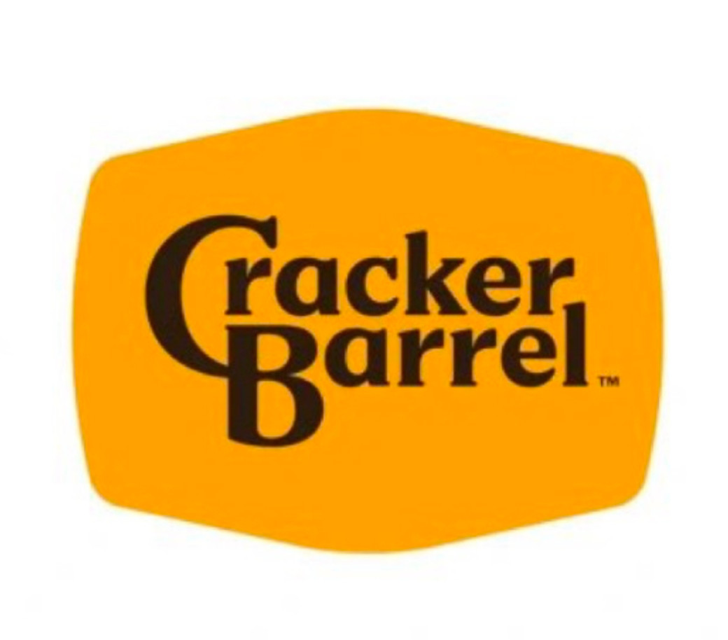
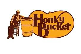
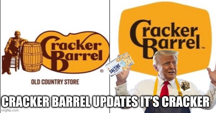
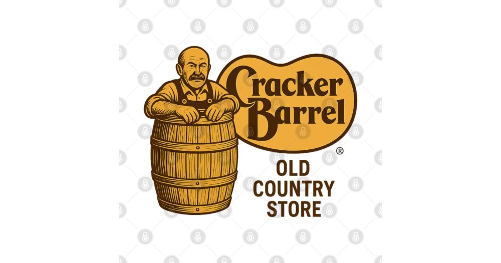
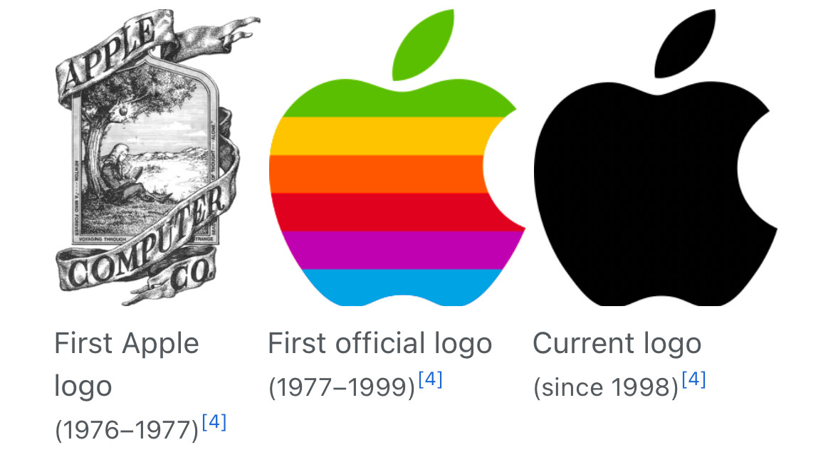
Cracker Barrel has rebranded for the first time since 1977
Not them removing the cracker and barrel
Cracker Barrel has rebranded for the first time since 1977
People are looking at me and wondering why I’m laughing so loud
Better than their cracker ass Cracker Barrel logo I guess
Cracker Barrel? I don’t even know her
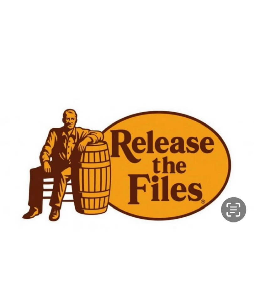
The yellow part of the new logo is vaguely barrel-shaped, at least.
i love you for this post.
Cracker Barrel has gone woke
I always thought those were directions. There’s cracker, there’s the barrel, you put them together. Cracker Barrel. Insert white southern racist into wooden containment cylinder, then proceed to discard in your nearest river.

Hopefully they do away with the 1 hour lesson of who that guy is in the new hire training and cut 4 hours of training down.
did we just witness a murder?!!!
“they’ve gone woke”
I just heard where they were mad that CB had hired 1-3% more minority workers nationwide. put the cracker back!
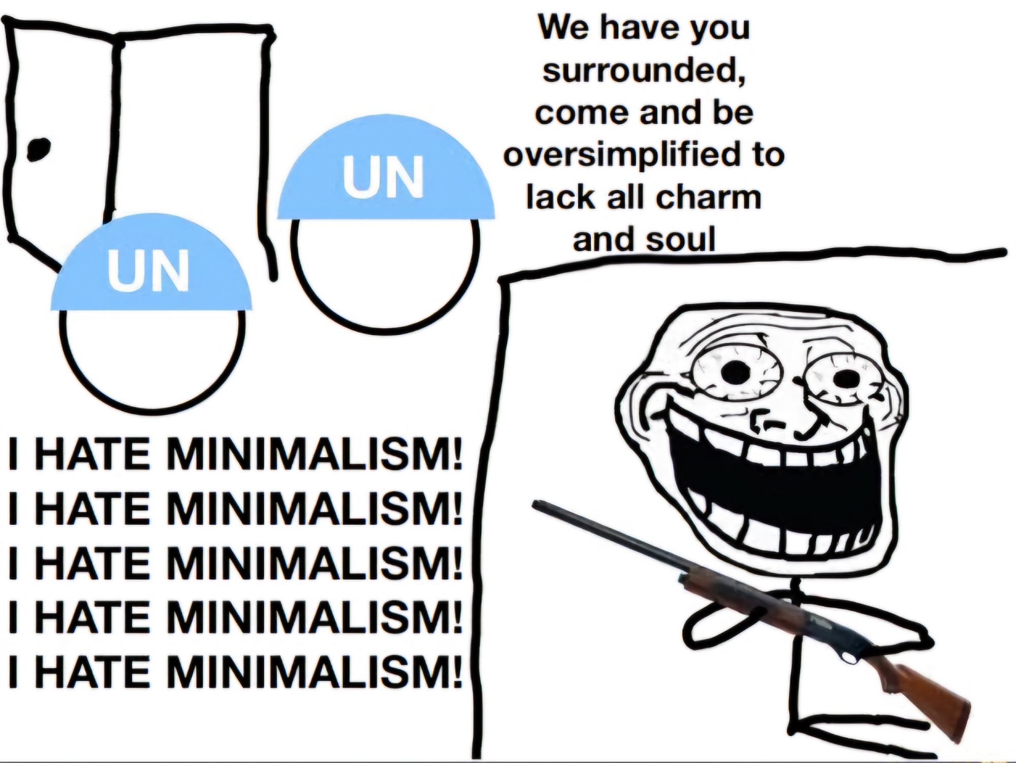
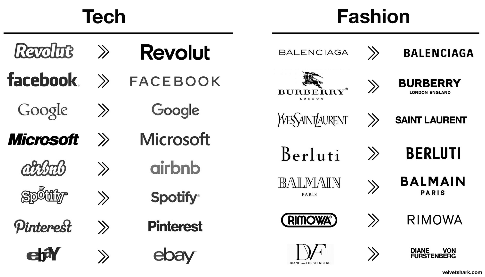
I hate corporate minimalism, makes every single logo it touches look bland and boring as fuck without fail
Reject modernity. Embrace cracker and barrel.
😂😂😂
Its almost like they're revising historical icons. 😤
Up north, we call it
Minimalist logo, minimalist flavor. It makes sense.
😂🤣😂🤣😂🤣😂🤣👏🏾👏🏾👏🏾
🤣 my asthma 😭
Ah yup
This is like the 20th time I've seen someone make this exact joke
CRACKER BARREL GONE WOKE! I’M GOING BACK TO BOB EVANS
Art is hard
I still ain't going. I feel like as soon as I leave they gone sic the dogs on me. Lol
They really took the power out of the logo😱
What's the fuss? There were cracker barrels filled with crackers in some stores long ago. Their new logo is...meh.... As a graphic designer I have lived through many meetings deciding things like this. Suits nitpicking through every conceivable argument & then deciding on something safe & boring.
😂
As someone with over 25 years of graphic design experience, I couldn’t just sit back and watch you all spiral into grief counseling over that tragic new Cracker Barrel logo. Ladies and gentlemen, I humbly present, for your judgment and memes, the brand-new Cracket Barrel logo. You’re welcome.

This is one of the grossest rebrands I've witnessed, pretty soon I'll bet all them stores are gonna be that painted white dentist office asthetic
They don’t list breakfast all day now. What good are they (other than fried okra) if they do not offer breakfast all day??
"Hey wanna go eat at ?"
It's so ugly! 🤢 Why do they all keep ruining their own iconic logos?
And they even got rid of the legit charming curve from the K. SMH
Cracker erasure is what the conservatives were afraid would happen.
Sort of went from Cracker Barrel to Cracker & Barrel
Finally!! When someone explained the barrel and the whip, I just couldn’t go back to that place. I’m not sure I’ll ever be able to go back.
Aw man look how they massacred my boy (the long k)
Wait, who's the cracker? Is that slang for an old person?
Can’t wait to grab breakfast at !
Yes that will remedy the $8 side of mershed perderer
KKkrakkker Barrel has fallen
Getting real sick of this late 2000s iPod touch icons.
Oh no? How will wypipo be able to find it now?
😂🤣☠️
They also modeled the stories so they're shiny and open, which means you can hear every damn conversation in the store now.
I laughed way too hard at this. Cold and accurate AF
Look, I don't hate minimalism! It can be done exceptionally well and it doesn't necessarily mean lack of charm or character. But these companies are doing the equivalent of painting their house gray for broad appeal and it sucks!!!
Never gonna eat there no matter how much I like southern food.
They literally tried to fire people for being gay.
Real ship of Theseus situation here.
yoooo
Then what's the point anymore :(
Sir
God damn what a post
Took me a sec…

😂😂😂😂😂😂😂😂😂😂😂😂😂
cracker erasure, smh...
BOOOOOOO
I’m probably seeing things…but is it just me or does the ‘k’ in the old logo look like a whip?
LMAOOOOOO
I'M WHASIAN AND THIS IS HILARIOUS OH MY GOSHHH
Corporate minimalism fucking sucks.
Is the new push to minimalism so that AI can read it better?
Well played
At least they didn't remove the Indian and keep the land.
🤣😂
We are in the darkest timeline indeed.
I don't even eat there anymore but fuck, bring back the cracker AND barrel. It's literally in your name.
ffs please stop making everything minimalist, I promise it doesn't look even remotely as cool as you think it does
+2
It's so ass. I like the lil guy on his chair.
😭😭😭
Why not just go full throttle minimalist mode and reduce it further to "The Barrel?"
😐😳🫢🤭

Cracker and barrel in this economy? Companies would never give us both
I can't wait till this minimalism trend dies, everything is this sterile sad Ikea esc look these days
HA! HA!

There goes a widely recognized and respectable brand
I legit… spat on my screen reading this. God damn it.
new name:
😆😆😆

Honky Shack has a new logo.
F@ck Cracker Barrel 😠🤬
I can here MAGA now: "go woke; go broke!"
The sheer restraint they must’ve had to not switch it to another Sans Serif font logo.
Without the drawing of the cracker and the barrel, the name doesn't mean much.
Sorry, I can't seem to find the tongue-in-cheek emoticon.
The woke mind virus strikes again :(
I remember when the idiots went apeshit when Cracker Barrel began offering, simply as an OPTION, fake breakfast sausage instead of the real thing.
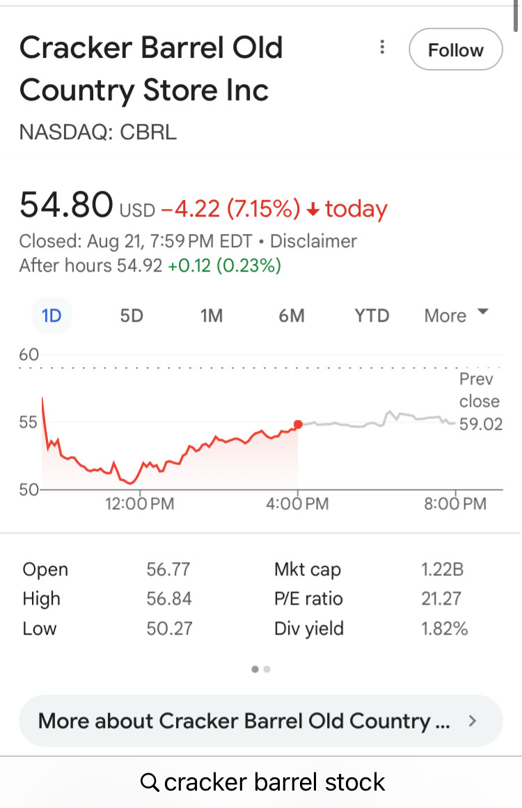
Imagine how much Cracker Barrel paid for this logo disaster. They don't know their customers and they didn't do a survey. Cracker Barrel better dump the new logo fast. www.cbsnews.com/news/cracker...
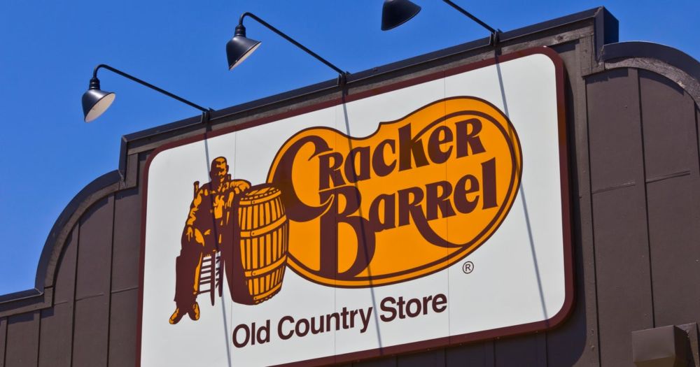
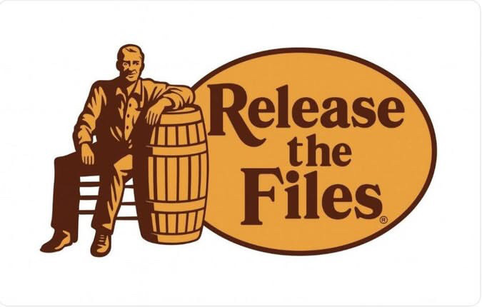
Cracker Barrel stock plunged as much as 15% after the restaurant chain released a new logo that removes its long-time image of a man leaning against a barrel.
SCREAMING
They wouldn't have removed it if they didn't fire Brad's Wife after 11 years of service.
If they need a new cracker on their image they could always ask me
If the cracker is still there is it really a rebrand? Lol
😂
I’m sure you can still find plenty of crackers in the restaurant.
So this is all over the missing Saxon serf?
They finally put a cracker in the barrel. 🧓🛢️#culturewar snarkyfaith.dashery.com/products/791...
A snarky parody of the classic Cracker Barrel logo — featuring a literal "cracker in a barrel." This vintage-style design pokes fun at cultural outrage and nostalgic branding, perfect for anyone who e...
giggle
🤣🤣
lol
nah nah they stuffed all the crackers into the barrel, that's why the barrel shape behind the words is so fat in the middle now.
Long as they don't fuck with this.
How dare you! I was enjoying that drink before I spat it out! hahah!
They got rid of the cracker but kept the barrel. ... wait, hang on ...
Made me laugh
Is there like a rule that says every corporate rebranding must be literally the most dull thing imaginable
Yeah. That logo just was not straight forward enough for corporate lmao
Now put a green ring around the outside, a few tree tops above the name and change it to Ponderosa. Right back to the 1980’s.
If they had juice, people would recognize just the amorphous yellow blob without text.
Look, let’s just be glad they’re not rebranding as CB.
Why are republicans making everything political?
They should rebrand as CRAGGABURL since that’s how it’s pronounced by, well, everyone that actually goes there
The yellow is the barrel. At least removing the cracker is a step towards inclusivity.
I’m just glad your tweet has more traction than the other person who tweeted basically the exact same thing an hour later.
"can i get a logo with no cracker and no barrel?" "no cracker and no barrel? yeah lemme get a logo with NOTHIN"
the cracker is just in the barrel now
🤣🤣🤣🤣🤣
Watch it become “C.B.’s” in a year.
Lolol

That damn minimalism strikes again.
Typical liberals trying to erase our history.
The cracker is always implied
Instant unanimous public disdain. Old people grabbing pitchforks
My EXACT thought!
That new logo’s text is too high, needs to be moved down to look centered.
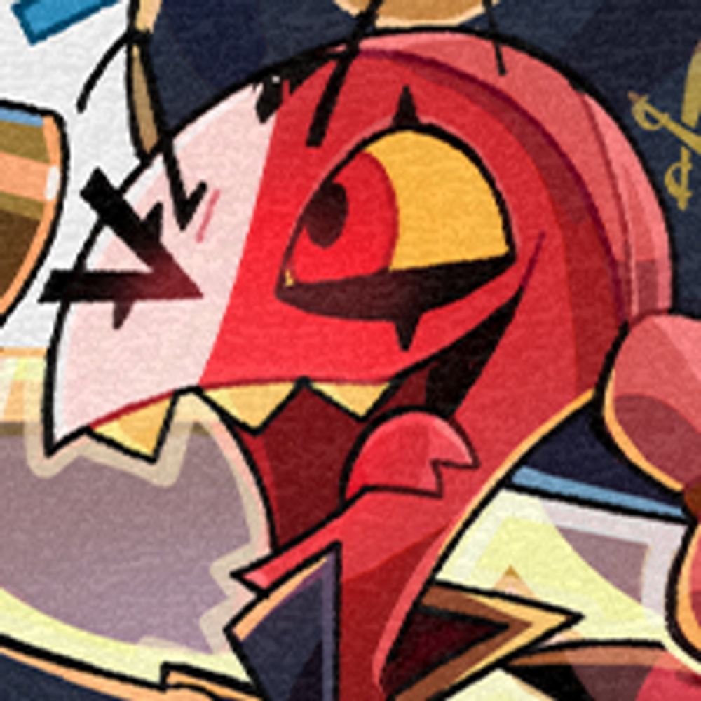
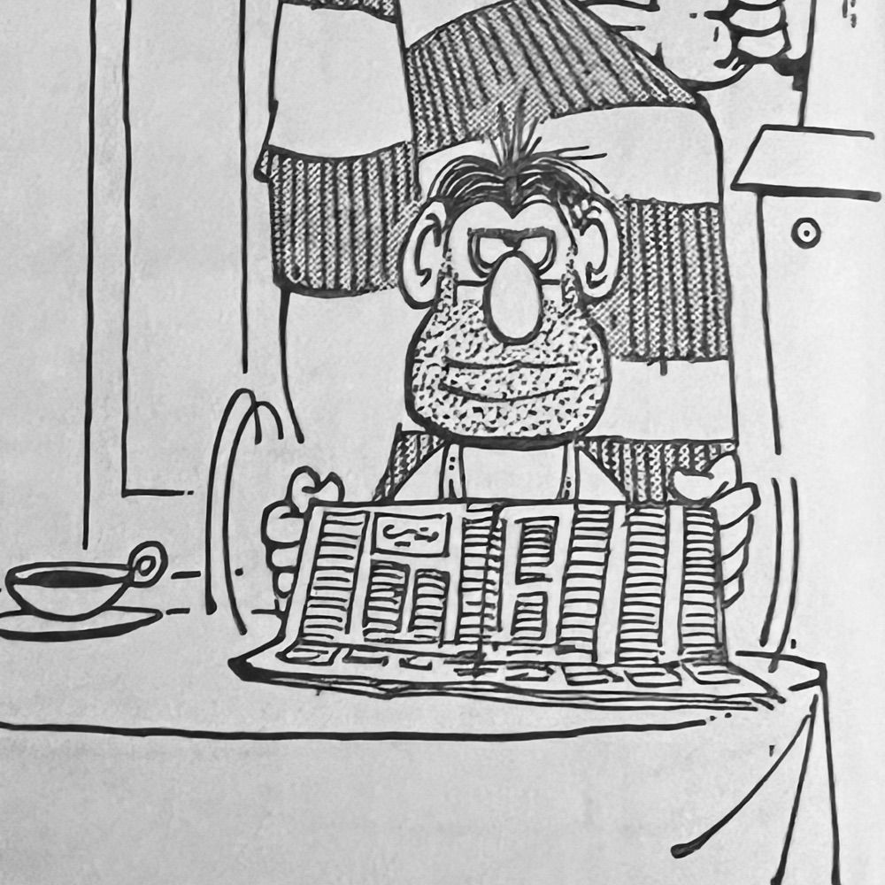
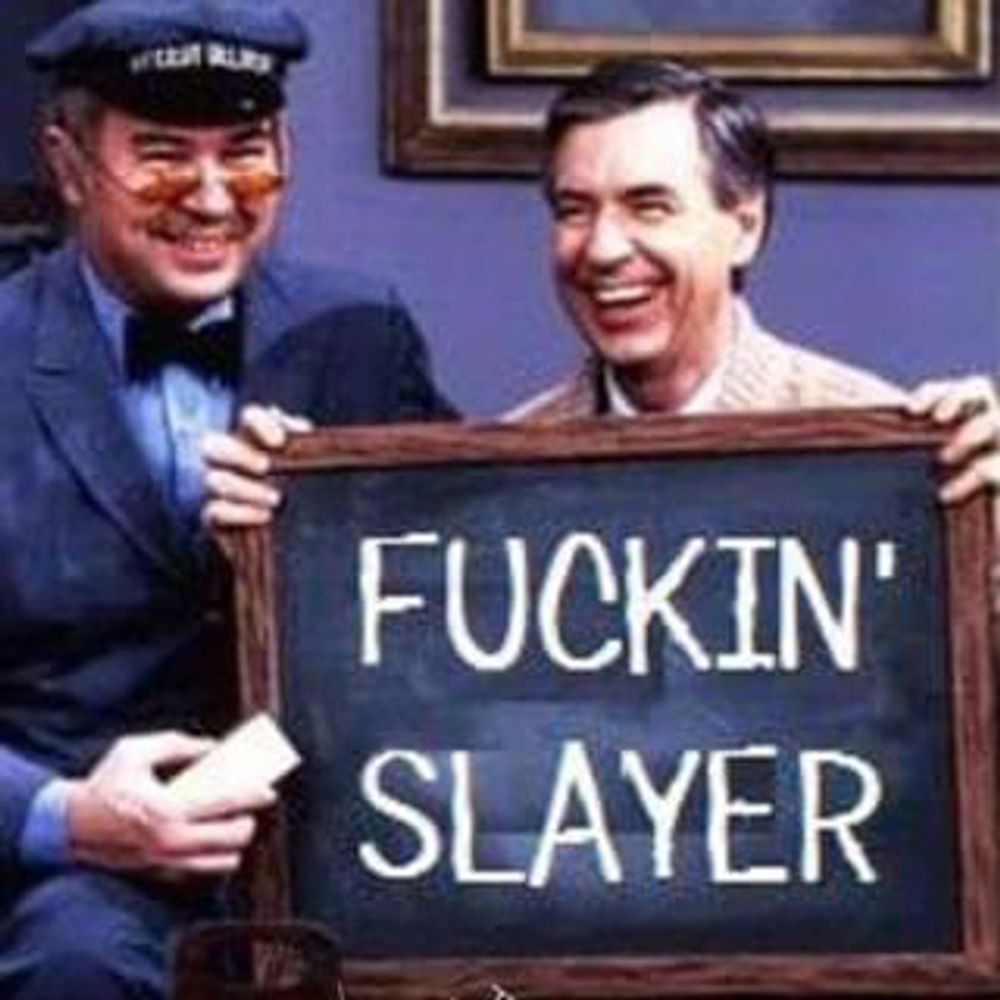
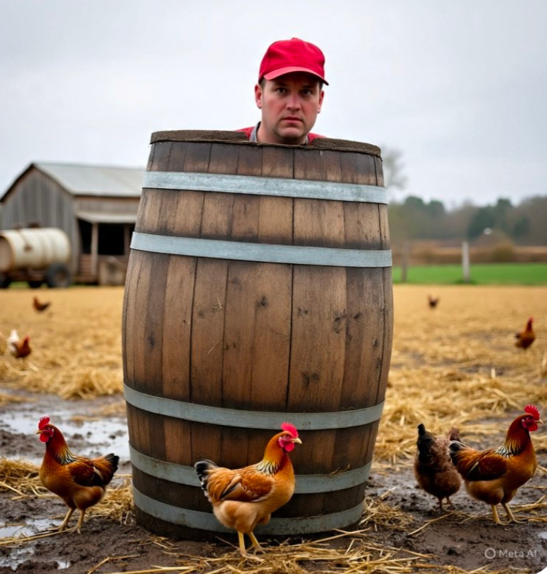
They forgot this guy. (That's why they're mad.)
“We’re going back to our roots” “nostalgia” “focus groups thought there was beer in the barrel and we don’t sell alcohol”
Any one of those could have been said by the agency
Beyond ever the worse place I’ve ever “managed”. Worked there 4 months as an Assistant General Manager few years back. Would never recommend.
technically the barrel is still there, kind of
Alt history says its graham cracker themed
Its really sad to see logos simplified
Love it when someone makes six or seven figures for an idea that's basically "I farted this out in Canva. Same colors, tho."